Typographical Posters

Didot Typographical Poster
Created by Firmin Didot in France between the late 1700’s and the early 1800’s, Didot is a beautiful, high-contrast Midcentury Modern display font. To showcase its unique features, I created a poster from its entire alphabet, including uppercase and lowercase letters, and numbers 0-9. I chose to arrange the shapes to put emphasis on the typeface’s sense of movement, and reference Vogue and CBS, two companies that famously use Didot in their branding. The colors I chose are inspired by vintage fashion magazine covers, including early issues of Harper’s Bazaar, and Vogue.

Hoefler Typographical Poster
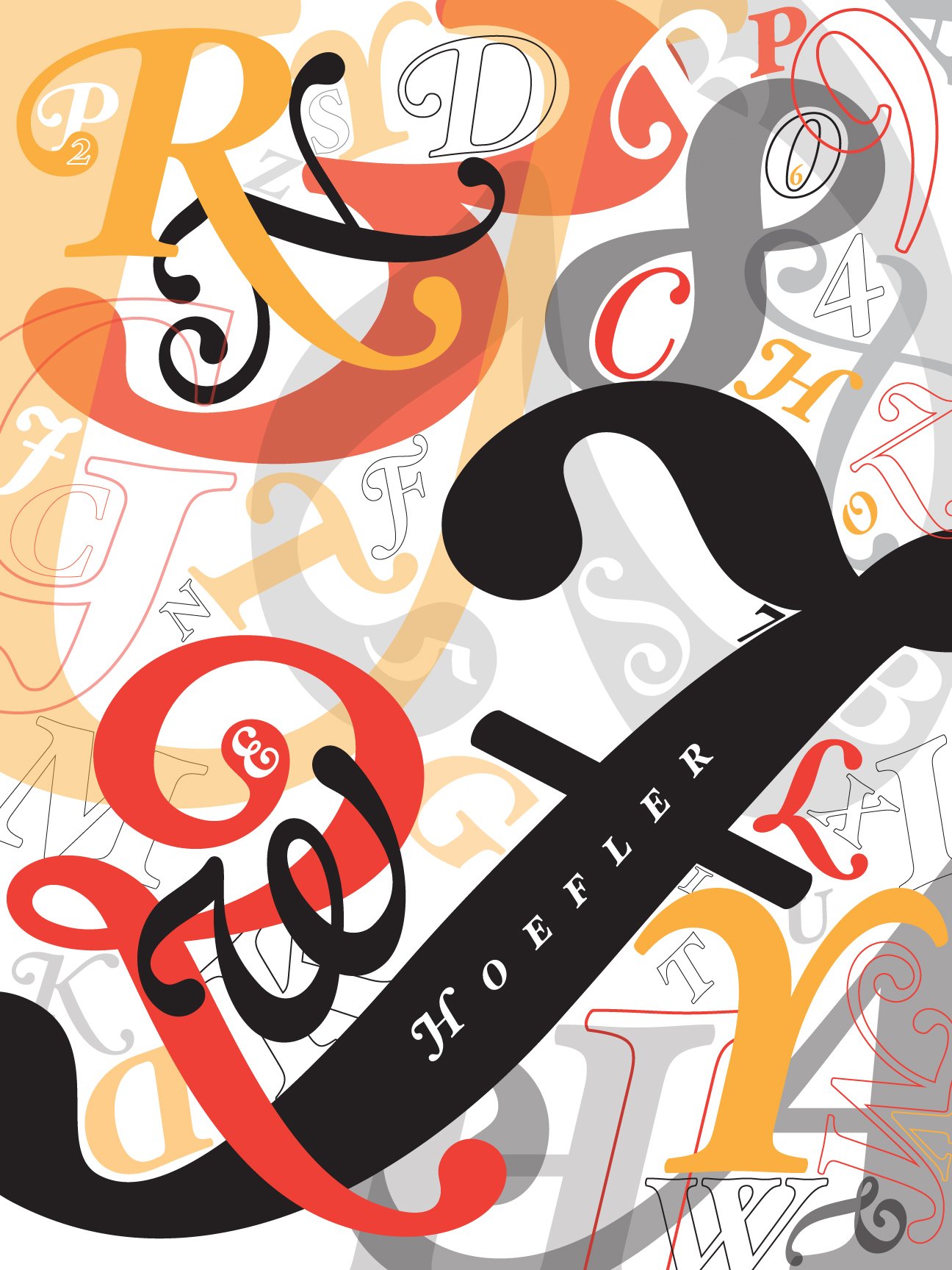
In order to highlight how visually interesting the Hoefler typeface is, I chose to create a poster with movement, depth, and variety. In order to create depth, I adjusted the opacity of some objects, in order to see all of the layers of the design.

Bauhaus Typographical Poster
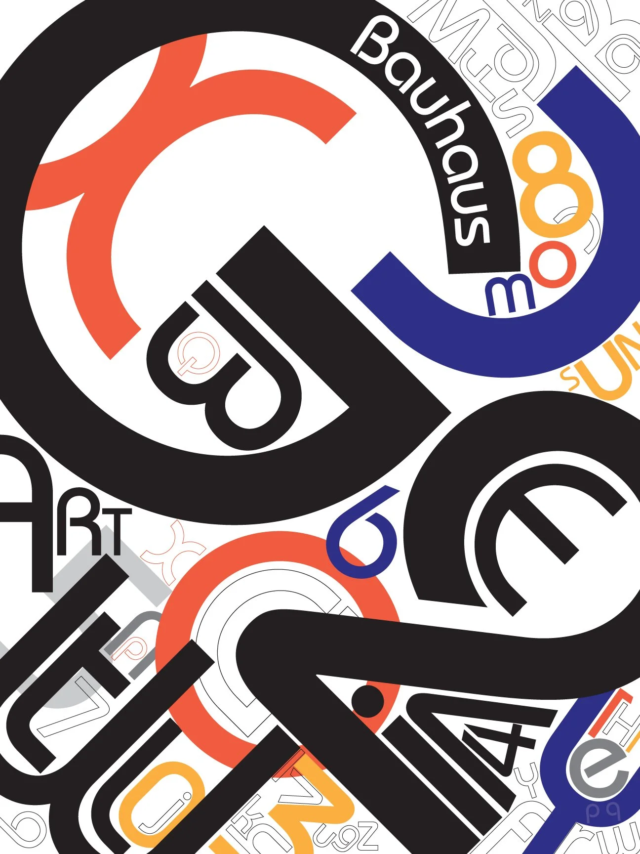
Both angular and rounded, Bauhaus features many interesting geometric elements. I chose to arrange this typeface to be reminiscent of abstract art, nestling and overlapping shapes to create areas of serenity, as well as areas of intense visual interest.
